JOI Products

Overview
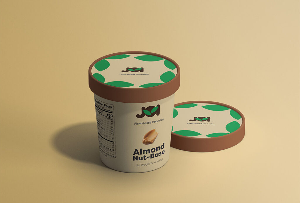
Creating a rebrand – JOI Products branding exemplifies a clean and friendly solution that prioritizes sustainability and health consciousness. The natural color palette represents nature and the environment. The logo is simplistic and friendly, as it uses roundish shapes and it reflects the brands vision of using just one ingredient. The typography used is also roundish and is a modern sans serif. Social media and traditional banner ads were created to showcase this brand and their product.


Brand Style Guide
A brand style guide is found below to help establish consistency in the brand.